Red Baron's New Toys
Introduction
These are a series of seminars which will teach us on how to plan and create the initial stages of an animation such as layout, background, character designs and storyboards. These are all important aspects of creating an animation being a short or a feature film. because without clear and professional planning there would be little or no organisation and the final product may not be the result you intended.
Thursday 28th January
This was an introductory seminar which showed us the basics of backgrounds and layout designs. These are the backgrounds for the characters to inhabit much like a stage for the characters in an animation. Moreover this is the world that these character's inhabit which their adventures take place to entertain the audience.
These layouts are created as designs for the background and to clearly show exactly what the world is in an animation. An example of this could be a city and the layout plans where all the buildings and scenery are and where the characters will be.
We were given a script to read:


From this script we were assigned to create layouts and backgrounds for the script which would then be used later for a storyboard. These layouts and backgrounds included:
-Red Baron's Castle Exterior - Day
-Red Baron's Castle Exterior - Night
-Red Baron's Castle Interior Throne Room - Day
-Red Baron's Castle Interior Throne Room - Night
Backgrounds and Layouts
Initial Sketches
From there I created these initial sketches from my first thoughts on what the backgrounds could be:

During my initial designs and thoughts I had a distinct image of an elevated throne with stairs leading to it with a very distinctive shape. This is taken from the perspective of someone who had walked into the throne room (meeting the Baron).

This is the initial layout design which showed where characters would move and be staged and clearly shows exactly where everything would be in the scene/setting.

This sketch was meant to show the point of view of the Baron from his throne however i drew this at the wrong perspective and makes the throne appear to be on the floor rather than elevated.

This is a list of initial ideas for the Baron's character. This is because I ran into a mental block and couldn't design the castle without understanding the baron's personality. This is because I found it important to design the baron's home from the Baron's taste and understand why he would design his castle that way. This is because if I understood the baron's character, I could design a convincing and suiting castle for the baron to live in.

Continuing from the last page i began to mind-map the Baron and see what I could find. As I continued to read the script I found that the Baron liked toys and that Baron sounds much like a German authority figure much like a king. I therefore drew a sketch of a coo-coo clock because I began to have thoughts that the Baron could live in such a structure to reflect both his power and his interest for toys.
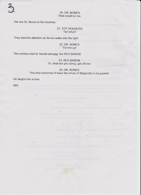
However i did not continue the coo-coo design because it did not look like a castle anymore and the script states'castle'. It is important to read and understand the script because I cannot go off track and produce an incorrect design.

This is a very rough sketch of what the Baron could possibly look like. I based this sketch off the idea that the Baron is a small person with a Napoleon complex with a very large crown and cape.

This is a sketch of the layout of the wall in the baron's throne room. I intended to keep the design simple and repetitive which would make it similar to repeat. this is because if the background is too complex it would make it difficult for the audience to differentiate the characters from the background.
--Initial Designs--
Castle Exterior
I created a mood board to generate ideas for the Baron's castle [exterior].
I already had an idea in mind what the castle would look like; therefore I obtained a range of images which were similar to my idea to create a detailed design.

From these initial sketches and mood board I took these designs further by creating more detailed and planned designs:

This is a plan of the establishing shot of the exterior of the Baron's castle.
I planned where the camera would be and the layers of content which would build the composition.
it is important to layer a background because it adds depth to a scene and expands the world which these character's inhabit.
I took the design further on the next sheet.

This sheet shows the establishing shot of the exterior of the Baron's castle.
I used different colours of pencil crayon to represent the layers of distance of the objects from the camera.
Red- Bushes, trees and leaves in the wind as the first layer.
Purple/Red- More trees, path and rocks as the next layer.
Blue- More path, more rocks and the castle for the next layer.
Green- The Moon/sun, clouds, more rocks and distant hills/mountains as the furthest layer.
I should have used a different colour for the second layer because it is not clear on a screen because the first and second layers appear very similar.
I chose for the simplistic design because allows me to design both the night and day layouts only by changing the colours which makes the process efficient. This can also be said for the thrown room design.
Throne Room [Baron's Castle Interior]
I also created a mood board to generate ideas for the Baron's throne room.
Again i already had an initial idea in mind what i wanted the design and layout to be; therefore i gathered a range of images which reflected my plan.


This is a design for the layout of the Baron's throne room. This is designed to show the clear positioning of objects and characters within a setting.
I drew this design rather small because I intended the views and scale of the throne room to be exaggerated which would create a stylized look.
An example of this could be making the throne appear really far away and the room to go on forever.

This is a background design for the throne room from the perspective of the Troll (see script).
I am not pleased with this design because the room is not large enough and I do not like the large clock behind the throne as it makes the composition of the background too crowded around the center.

I tried another design with a grand father clock behind the throne because there is a scene with a grandfather clock (see script). However I felt this design was again too small and that the throne was obscuring the grand father clock.

This design i moved on from the clock ideas and tried banners instead which would reflect the baron's vanity and need to express power. In addition i added the 'pile of killer daisy chains' because they are in the corner of the throne room. I like the positioning of the killer daisies however I feel that the room was again too small to exaggerate the scale of the Baron's power.

From the previous designs I chose to create the throne really small to allow myself to create the rest of the room. This design i feel expresses the scale of the room much clearly. In addition I took further reference from the mood board with the columns and chandeliers.
I will continue my deigns of the layout until I am happy to continue.
Thursday 4th February 2016
Character Designs
Introduction
These next designs are of the characters from the script, we
had to develop these characters and produce a turnaround for each one. A
turnaround is a series of drawings of one character where each position is
different from the next because the character is slightly turned. These are
done to visualise the character in a 3D space and understand the form of the
created character.
Red Baron
I started with the Red Baron because this character had the
most lines and greatest sense of personality within the script. With initial
mind mapping from the dialogue and actions of the red baron to understand his
intentions and thoughts, I started to develop an idea of what this character
would be.


I felt that the baron was an eccentric because he is a
person in power and taxes the locals with Toys.
This immediately gave me thoughts of the baron from the film ‘Chitty
Chitty Bang Bang’ as this has very similar character in the sense he is
basically a child. However I felt that this would be predictable and not very
unique to create the Baron as a conventional ‘fat, spoilt leader’. Therefore I
started to exaggerate parts of the baron’s body and found that this was the way
forward.
After much experimenting I found that the oval shape created
with old fashioned clothing could be exaggerated and shown as his pants. This
created the ‘watermelon’ body and to keep the design simple, I simply added
contrasting flimsy arms and legs. I feel that this gives the Baron a very
unique silhouette.
To take the design further I started to design the walk and
details the character had whether it was small or quite noticeable. An example
of this is the idea that the throne room has a long red carpet, but because I
wanted this Baron to be different I made the carpet his cape. This means that the
Baron’s cape is incredibly long and that it has no end to represent his need to
express his power and wealth.


As this was the first design I had created out the
characters, the Red Baron had a great influence on the rest of the characters
in their style and colour. This is because the baron was so exaggerated in
personality and style that the other characters had to compete to not appear
dull or boring. Therefore from this initial design I chose to make my theme
exaggerated and that the characters would be vibrant and diverse.
Troll
Reading the script I already had an idea what the troll
would look like, I imagined him as a large and forgivable idiot. I imagined his
speech as being very deep exaggerated in how dumb he is as he tries to pass off
a turnip as a toy. I started with initial designs of what shape he could be and
what he would look like.


In particular I had difficulty with the face because I had
already imagined the body, however the performance would be in the face and how
he would express his emotions despite his limited intelligence. I started
experimenting with different ears and eyes and the positions of them because I
couldn’t seem to get exactly what I wanted.

Eventually I found that these large simplified human ears
were what I wanted as they made the troll more human; more relatable. This is
because I wanted the troll to be a likable character and so I felt that a
softer look would make the troll likable.

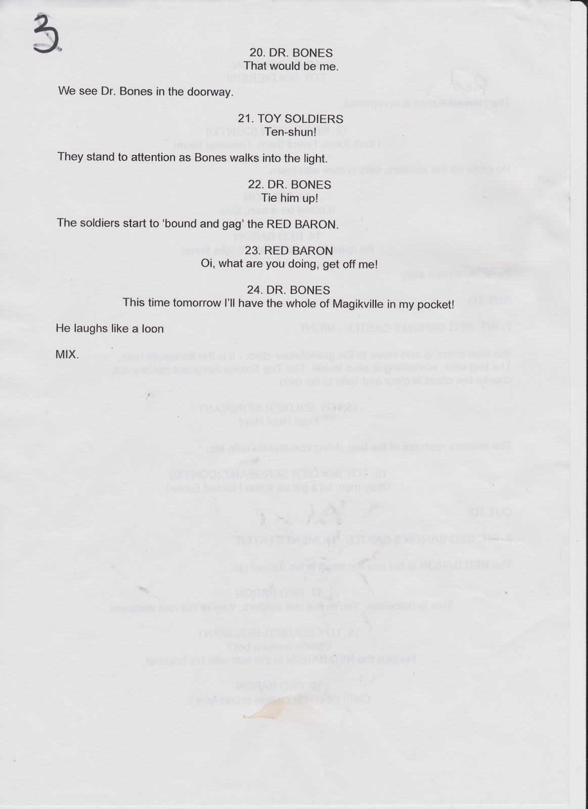
Magikville Minions
I found the Magikville minions difficult to design because
they are only shown briefly and I had an idea what they would be ‘like’ however
I could not design exactly what I wanted. I wanted these minions to be smaller
than the baron, this way I could imagine the Baron using the minions for
amusement or take his anger out on them. This would explain why the baron is
still in power despite his abuse of power and irresponsibility.


They would also have to be carrying ‘old tat’ into the
throne room.
After some time I finally started to develop an idea on what the Magikville minion would look like:


I went with a very simple circle shape as I followed the idea of simplicity and contrast amongst the other characters. The personality of the minion is negative as they just want to live their own lives in their peaceful town, and not be making toys for the Baron.
Elf
The Elf was difficult at first because I found that an elf
would be seen as a Christmas creature with the bells and colours resembling
Christmas. However I already had an idea what the elf may look like with the
huge gardening gloves and that I wanted these gloves to be as big as his body or even bigger). This would make the character more interesting because he
would have to compensate his walk with the huge gloves and lean back with small
leg movements.


After development sketches I stuck with the design of large
ears, hat and gloves. The rest of the body is very small or even hidden like
his face. I felt that the elf was just there to deliver these daisies and that
he didn’t really want to be there therefore I wanted to give him a ‘worker
aesthetic’ where his face isn’t seen to represent that he is just getting on
with his job.
Pesticide
Pesticide was one of the most difficult characters to design
because she only has one line in the script and that there isn’t much
information given about her despite her giving these toy Soldiers to the baron
and that she works for or with Dr Bones.
Therefore I started with the idea that she is an evil henchman because she
appears to be completing a task for Dr Bones.


With different head shapes etc. I stayed with the idea of
the nose being long and pointed and the face long and narrow, I had difficulty
to design the body which this head would sit upon. I had long and skinny, short
and fat etc. I started to research the shapes of cockroaches because I linked
this to the name ‘pesticide’ and this created the long arms and legs. I then took
this further with the contrast of her being a court jester as I felt that the
script suggested that she was sarcastic and depressed character with her
deadpan one line. Taking this further I felt that this was because Dr Bones
doesn’t treat her respectfully and sees her nothing more than a clown.


Benson
Benson is another character with a single line which I had
to develop a character from. Because I had read the line as concerned advice I
designed Benson as an opposite to the Baron. This is because the character I wish
to develop would be a level headed individual who is very down to earth, and
would be far more suitable for a ruler of Magikville; a complete opposite to the
Red Baron.
Basing the design of Benson on the opposite of the baron, I explored
the shapes of the baron and tried to make a very striking silhouette. This is
because I would imagine Benson and the Baron working very closely together in
ruling the kingdom; therefore they would have to contrast in: colour and shape
to stand out from one another.
I ended up with a design for Benson as a large, strong and
serious looking man with a suit as I felt this reflected his responsibility and
his serious attitude. Moreover it could be said that the kingdom could not run
with an individual leader, because if Benson ruled Magikville, it would be very
dull and boring whereas if the baron had complete control he would destroy
Magikille without realising it.
Toy Soldiers
The Toy Soldiers were fairly simple to design because to fit
in the theme of a traditional fairy-tale/ medieval times the Toy soldiers were
inspired by Christmas nut crackers and old fashioned toy soldiers.


I chose to keep the eyes hidden as this de-humanises the toy
soldiers as they are only toys; however I can still maintain a sense of character
through the performance and voice of the toy Soldiers.
Dr Bones
Dr Bones was a challenge to design because I had to
understand his character first before I could decide on what he would look like.
I therefore concluded that Dr Bones would be an evil character and he would
like to control Magikville for himself for his own intentions. His character
would be just as wacky as the Baron’s which makes the baron a mirror of Dr.
Bones as this poses the idea of that if the Baron had done something
differently he would be Dr Bones. The main difference between the two characters
is that Dr Bones has focus, develops plans and that he knows what he wants whereas
the Baron has everything and doesn’t know what to do and is a very impulsive character.


I based his costume off a surgeons coat and that it is all
one huge shirt that restricts his feet greatly. This means that his feet just
rotate on the spot to make himself move this is followed by great swaying
motions with his shoulders and his head much like a snake which I feel creates
a very interesting walk.
Conclusion
I had designed all of these characters with simplicity,
exaggeration and contrast in mind. This is because I intended the characters to
stand out from both the background and from each other effectively.

Because I have
planned this I feel that my character designs are effective from the script we
have been given. However if I had more time to develop my initial ideas, I would
have taken the script much further and interpreted the script in different
ways. This means that in the future I will not restrict my imagination to the
literal words that are read from the script but rather take the meaning from
the words and develop my ideas around that. (An example of this could be: That
my castle designs are of a castle. However a castle could mean many different
things – a castle suggests safety, strength, power etc. Therefore I could
design a different location based upon those words whilst maintain my
consistency with the script.).
Backgrounds and Layouts Revisit
After some thought and inspiration, I felt that I had to
revisit the designs for the castle exterior and interior. This I because I felt
the castle exterior (in particular) was rushed and not very creative as the
castle is rather rectangular and not very appealing compared to the character
which inhabit the world. The initial sketch was based upon the idea of the
establishing shot I wanted to use, and because I wanted to sketch the shot
before the castle’s design, the result of the castle was very plain and square.
This was not as apparent with the interior however I still felt I wanted to
redesign it. After reading through the script again I noted all of the
characters, events and props within the scene that I would need to add to
ensure it is consistent throughout. An example of this could be that at a later
scene there is a grandfather clock; therefore there has to be a grandfather
clock.
Exterior


I took inspiration from very stylised castles from cartoons and concept art which gave these castle very strange and unique silhouettes. Therefore I started to generate sketches of large houses and castle from an angle to try and develop and interesting shape of the Baron's home. I went with a haunted castle shape because I of the variety of shapes and lines make the castle very appealing.

I kept a lot of the ideas from the initial sketches because that is how I wanted it to look, however I was not happy with the castle's aesthetic.
Interior


This time with the interior designs I too into consideration the movements and space of the characters and planned where they would be, where they would move. In addition, I have added a greater sense of the baron's personality through the Throne room's design as being eccentric and that the Baron is wealthy.
I feel that I have spent more time with these designs and I
am much happier with these ones than the previous ones. From there I will add
colour and shading to these designs to create a design of exactly how the scene
would look like in the final production. I will have to produce both Day and Night designs in colour and lighting for both the exterior and interior.
Thumbnails
Now it was time to move onto thumb nailing the script. This is a process much like story boarding however thumb-nailing is much rougher and allows a greater flow of ideas. Because the idea is rough, it doesn't take long to create or alter and this allows the story to be told quickly rather than concerning ourselves with details.
After I had read through the script a few times I decided to start my thumbnails:


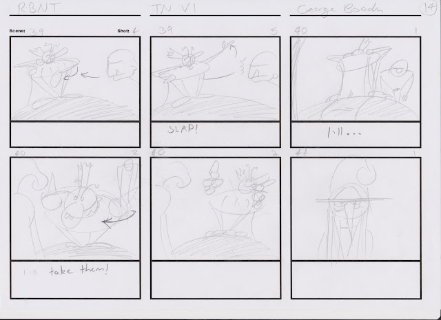


After I had read through the script a few times I decided to start my thumbnails:


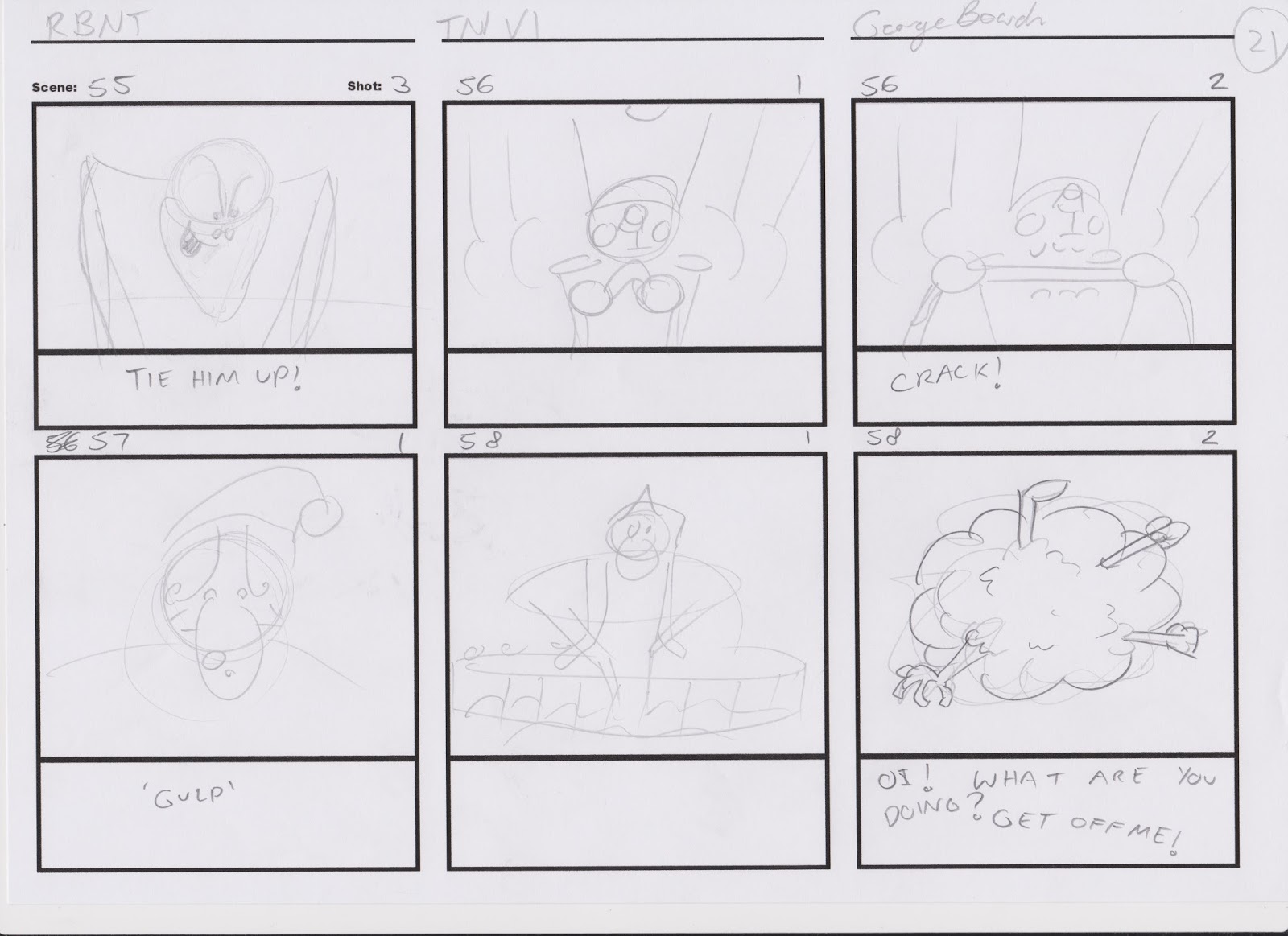


As these are my first thumbnails, they are extremely rough, however I believe it conveys the story. I will then import these scans into Toon Boom Storyboard Pro to create a storyboard and an animatic. This will allow me to see the flow of the animation and ensure all of the shots are correct and that I effectively tell the story.
Colour Designs: Characters
After I had created the designs of the characters I decided to design the colours for each one. I researched the colour wheel and colour meanings to ensure that the colours of each character contrasted form one another and that they were diverse.

[Colours on opposite ends contrast and colours next to another complement eachother.]
[I.e. Blue-contrast-Red : Red-compliments-Orange]
In each of the designs, I chose to contrast each character from another and ensure that colour meanings aligned with each character too. I chose to keep the colour to a minimum as this makes the designs simple and effective.
Firstly I started with the Red Baron. As 'Red' is in the name I took this for inspiration for his colour pallet. I believe this colour also portrays the Baron's wealth and power as Red can be seen as a royal colour.

I then designed the colours of the troll. I chose greens for the troll as it is a friendly colour and I wanted the troll to be likable and friendly.

Then I designed the Elf with the colour Orange.

I chose blues for Benson because I believe that his character contrasts with the baron's and I wanted to portray this through colour.

I chose purple for the toy Soldiers because purple is a strong colour which had not been used and I believed it would contrast effectively with the other colours.

I designed both Dr Bones and Pesticide with black and yellow in mind because black and yellow is often portrayed as dangerous or poisonous therefore I wanted the negative colours to reflect their characters. As they are working together I thought it would be effective to alternate the main colours of the two characters; therefore they are opposites but the same. Pesticide is yellow with darker colours whereas Dr.Bones is mainly black with some highlights.


The minion is only a background character; I had to balance the fact they had to stand out from the background; yet not be competing with lead characters like the Baron. As I saw these minions as labourers and poor, their colours are supposed to reflect that through their 'dirty' colour. Overall the colours are diverse and different from the rest of the characters and aren't as vibrant.

Here is a rough scale chart which portrays the size, contrast and colour of each character. I believe that I have chosen these colours well because each of these characters are completely different from one another and the colours support this.

Colour Designs: Backgrounds
After I had coloured the characters, I decided to create the colour designs for both the interior and exterior backgrounds.
Exterior
From the designs I created of the exterior castle, i started with a blue colour pallet to create a design for the Night scene:

I chose the dark blues as they portray darkness and cold which I want to achieve to portray night.

Exterior: Day. I used a lot brighter colours for the day colours because I want to make it completely clear that it is a bright day within the scene.
I intend to keep these designs simple much like the backgrounds of 'The Looney Tunes' which purely focused on the character's and their performance rather than the background. The background is used to support their performance or a tone for the cartoon. As this is my inspiration I intend to follow this same design.
Interior
This can also be said about the interior designs for both night and day. However this time I started with the day design followed by the night design.


These designs are created to shows the colour pallet of the background and I have chosen these colours because I want the backgrounds to be simple to allow the characters to stand out and allow the audience to easily read both the background and the charter's performance.
Colour Designs: Re-visited
After a discussion with Andy reviewing my work, we found
that some of the colour designs were rather dark. This is because I forgot to
consider the mediums which the cartoon may be viewed, therefore despite my
monitor displaying the colours I want, the darker colours (like purples and
blues) were shown as black. Therefore I revisited my original colour designs
and changed some of them. These included: Toy Soldier and Pesticide.
The Toy Soldier had very dark legs and features, therefore I
changed the colour of the legs as they were the darkest and largest area of the
character. Now that I have changed the colour to a lighter purple, it remains
consistent with the design and can be viewed on a range of mediums.

I changed the colour of the eyes of pesticide because her
face was a very dark area and wasn’t clear on other monitors. This is because
detail may not always be visible because the audience may not view the cartoon
in high definition. Therefore if the colours are very similar in close
proximity, it would just appear as a very dark spot. Therefore I changed the
colour of the eyes to a brighter blue; this would contrast effectively with the
dark eyebrows and make it easier for the eyes to be seen on a range of
displays.

From this I have learnt that in future designs I must
consider a range of possibilities that I wouldn’t normally consider to ensure
that my designs are effective across a range of mediums and displays. Taking
this idea further, I will ensure that the characters are staged well and
express their movements effectively; that they are clearly seen. Another point I have learnt is that designs are subject to change and that this is a natural process to be expected during a production. Therefore it is key not to be attached or bias to a particular design because it is very unlikely that it will be same by the end of a given production. This can be due to aesthetic or practical choices which can be discussed within a team or given by a superior, therefore a person must be open to these decisions and suggestions for an effective design.
Initial Animatic
After I had created the storyboard, I scanned all of the sheets, edited the panels using
Photoshop then importing them into Premiere to create my first animatic for the
project. This allowed me visualise the timing of the panels and gather an
estimate for the running time of the entire script. This animatic is only
initial and very rough, I will produce a clearer and final animatic later in
production. Our given estimate for how long the animatic and Pre-vis should be
around two and a half minutes; the animatic so far is around three minutes
long. However I cannot produce effective timing of panels until I have
collected dialogue for the characters to deliver; how long it takes to say a
line dictates the timing of the panel.
So far I predict that my animatic will be too long with the
dialogue, therefore I will have to ask for feedback about what shots are necessary
and what can be removed. Looking back through the storyboard, I have added
additional scenes which aren’t essential to the story, therefore I will go
through the storyboard and label what scenes I believe are essential and what
scenes can be removed.
Feedback from: Les
I received feedback about my progress and designs from Lez
who is our seminar tutor for this module. I showed him my initial animatic and
asked for ways in which I could improve it. This way I can receive criticism
now that I can act upon rather than receiving it later during production and
won’t have time to change. These are the points I received feedback on for the
initial animatic:


·
Timing-
The timing of the panels weren’t effective because some panels were too quick
and others too slow. Therefore I would need to go through the animatic again
and extend and reduce panels. This will be done once I have obtained dialogue
for the script, this way I can determine how long it would take to deliver a
given line.#
·
Direction
Arrows- I was told to add additional direction arrows to make it clear what
is happening and where the action is a given scene. I understand that the
pencil lines and the rough aesthetic of the initial animatic make these arrows
unclear, but I now know to make these actions clear for the final animatic.
·
Transitions-
were needed for a number of scenes; such as the exterior and interior
shots. I did not add these to the initial animatic, however had intended to add
these transitions in the developed animatic anyway.
·
Expressions-
the Baron’s face when he says ‘How?’ was not clear; therefore I need to
make it clearer what the Baron is saying and how he is feeling as he says it.
·
Acting- I
need to improve the acting of the characters by making it completely clear what
a character is doing within a scene. The
initial animatic did not make these movements and actions clear; therefore I will
add movement and additional panels to the final animatic.
·
Camera- I
had not added any camera movements to the initial animatic because it was only
a very rough version. However I did add the directional arrows to it; therefore
I would add these camera movements to the final animatic and wouldn’t need
arrows.
I was also told about other camera shots
which could be improved. One included pesticide smiling, because I had an over
shoulder shot of Pesticide, it would be effective to have a successive over
shoulders shot of the Baron. This rerates to cinematography and shot
construction which I intend to develop and improve.
·
Toy
Soldiers- There was a discussion about the scene where the soldiers leave
the bag and the sergeant orders his men. This is because I wanted a hive mind
of the soldiers; therefore there would be a million soldiers that would move as
one. However Lez suggested camera shots and angles that did not support this
design choice. I have applied this knowledge to other scenes and improved other
shots but maintained the design choice I had in mind.
From this I have learnt that I need to add everything that I
intend clearly into my work, even if it is rough. This is because an audience
may not understand what is happening or supposed to happen. Receiving this
feedback, I will apply this to my storyboard and move onto the ‘cleaned’
version.
Toon Boom Animatic
Using my initial animatic as a guide, I created a cleaner
storyboard using Toon Boom Storyboard Pro. This software is designed specifically
for creating storyboards and has a range of tools and features used for
storyboards. I have not used Toon Boom Storyboard Pro before I had to learn the
tools along with creating my animatic. I really like the style of the brush strokes
on Toon Boom and intend to maintain this style in my other work because
Photoshop doesn’t show my work that well. The brush within Toon Boom appears
fluid and natural, whereas Photoshop delivers a rather flat brush. This can be
due to me not using the correct brush; however I feel that Toon Boom is far
better for me for what I do anyway.
To create the animatic, I imported the original sketches as
reference, then traced the lines to create a clean version of the same panels.
I then chose to colour the characters for the animatic; this is because I feel
that this makes the characters really stand out from both the background and each
other and this is the style I chose to incorporate in my animatic. This was a
long process, however I feel that this necessary because it was the style I
wanted to achieve.
After I had completed and exported the animatic in Toon
Boom, I imported it into Premiere to add the final touches. I added subtitles
to the animatic to fix the problem of timing within my initial animatic. This
way I would read the lines myself and ensure they are onscreen long enough for
the audience to read. I also added title and credit tiles for when I upload the
animatic to Vimeo and YouTube.
I found that my animatic is too long even without the title
and credit tiles; roughly five minutes long. This is because I chose to keep
some additional scenes that I felt needed to be my interpretation of the
script. These scenes included establishing shots, gags and character actions. Without these I feel that my animatic would be
rather dull and very shallow way to interpret the script. Because I used Toon
Boom I am pleased with the aesthetic of the animatic. I will reflect the production
and overall project within the evaluation.
Link to animatic: https://www.youtube.com/watch?v=LymJSNipoEo&list=PLOr0uDukkOO31YcQcs8WuepRYpXeRjoTn&index=13
Pre-Visualisation
As part of this module we are also required to create a
pre-vis, which is similar to an animatic; however it uses 3D software rather
than 2D. A pre-vis is very simple and uses basic shapes and texturing because
it serves the same purpose as the animatic. To create a visual representation
of a given project before production, these don’t have to be detailed as they
used to show the essential construction of the product and is often subject to
change which would be implemented quickly.
I used Maya to create the 3D models of: the exterior of the
castle, the throne room, characters and props. It was essential to interpret
the script, storyboard and animatic first before progressing because I created
a list of everything I would need to create beforehand in preparation for
filming in Maya. These models aren’t detailed, however I feel that they portray
the character that they are by their basic shape and colour.
During animation within a pre-vis, this is also very basic. This
is because animation takes a lot of time and effort, and during pre-production
the product is subject to a lot of potential changes and if someone had created
full piece of animation for the animatic and it wasn’t kept in the product,
that person has wasted their time and effort. All they would have to do is portray
the movement of an object or character; therefore if the character has legs, don’t
move them and the character would glide. This is because a pre-vis s primarily used to polish
the storytelling and shot construction rather than the details of the product.
I have said before in a previous post that I don’t feel confident
with Maya, and wish to develop my skills and knowledge. I feel that this module
has been testing this and I feel that I have learnt a great lot from creating
the pre-vis. This is because I have used a great range of tools and techniques within
Maya including: Modelling, rigging and animation. This range has given me
insight to the possibilities of Maya and the problems that I have solved to achieve
what I set out for. I intend to have the Pre Vis completed before the end of
the week; therefore I have time to upload and face any problems before the
hand-in.
Link to Pre-Vis: https://www.youtube.com/watch?v=1wBT-PxXQ-s&list=PLOr0uDukkOO1UDt4cWFckSeoTu2cuYQA_&index=6
Evaluation
This is an evaluation of my progress through the Visual
Narrative module. Within this module we were given a script where we had to create:
designs for characters, backgrounds, an animatic and a pre-vis. These are all
parts of preproduction within a production pipeline and it is essential to
understand. As I evaluate my progress I have organised my progression through
the project as a full production pipeline, because there are many stages to
preproduction and I will evaluate each of these stages.
During the initial stage, I was reading through the script
and developing ideas through sketches and mind maps. I felt that this stage
went well because I felt that there was a great flow of ideas and as I read
through the script I was already imagining specific shots, character’s actions
and how they would be shown. I kept the designs of the characters stylised and
simple. I chose to keep the designs simple because: simple designs make the
characters easier to read, if a character is too complex, the audience may not
be able to understand them or even see them at times depending on the
background. To avoid this I, made the characters very simple based upon shapes
and based their colour pallets on particular colours which contrast each other.
In addition, I considered that these characters will be animated later in
production if this was a full production. Therefore complex characters are
harder to animate; therefore the simplicity of the characters makes later work
easier.
However, I fell that I would improve this stage by employing
a range of different approaches to generate creative ideas and think ‘outside
the box’. This is because as I read through the script I read objects and
character literally, whereas I had no limit in what these characters and
objects could be as long as I followed the structure of the script. It is
essential to generate these creative ideas as early as possible within
preproduction; therefore production can start earlier and allow for changes
where needed and time to face problems when they arise.
After I had developed the designs of other backgrounds and
characters, I created the storyboard. With the structure of the storyboard I
then created the animatic and the pre-vis. The thumbnails I produced was
detailed enough that they were storyboards. In future I will start with
thumbnails because this allows the quick development of ideas and where shots and
panels can easily be changed. This allows ideas to flow quickly and without the
limitation of time or detail, I felt this limited me during the creation of my
storyboard. This is because I generated ideas to change the storyboard late in
production and by that time if I had changed the storyboard and animatic I
would not be able to meet the deadline.
I created the initial animatic using premiere and the
hand-drawn storyboard panels, after reflection and criticism I amended the
improvements and moved onto Toon Boom. I chose to use Toon Boom Storyboard Pro
because it is a professional piece of software which produces effective results
with a wide range of tools specifically for storyboards and animatics. I had
not used this software before and had to learn how to use it as I created the
animatic, I felt that this was necessary because I wanted to try this software
and achieve professional results. Because I have taken the challenging approach
I now feel I have learnt how to use Toon Boom Storyboard Pro and this will help
me in future productions.
During the production stage I faced a number of problems
that delayed the creation of the animatic which meant I had to produce both the
animatic and pre-vis in a very short amount of time before the deadline. As
this was out of control, I can only reflect upon how I balanced these problems
with my work and that I met the deadline very stressed. I believe I’ve managed
my time well and was determined to complete the work on time.
During post production I edited shots and timing of the
videos from the animatic and pre-vis using premiere. I would also add subtitles
to adjust the timing of panels to allow enough time for the characters to
deliver their lines. This stage was rather simple but tedious as I had imported
videos into Premiere rather than images; therefore I had to cut the videos into
each panel and then add the subtitles and edit the timing. The 2D animatic posed
some problems for unknown reasons when I tried to create the start of the
animatic. The video corrupted and would switch to later scenes but the problem
was resolved.
I am pleased with the result of both the animatic and the Pre-Vis
because they both function and showcase my work well. However I would have
liked to have added spoken dialogue to the characters, this is because it would
have been interesting and a challenge to portray these characters and their
emotions through their voices. I was not able to do this because of time
restrictions and problems faced during production beyond my control; therefore
in future on similar projects I will try to add voices to the characters.
Overall I believe that I have worked effectively with
producing the work required and more before the deadline. I kept my designs
simple for both aesthetic and practical reasons and believe I have achieved the
final style I wanted to.
However I feel that I would make a number of improvements.
During the initial stage I now know to take more time to think outside the box
and employ and range of different approaches when generating ideas. This way I
can produce a product that is different and unpredictable, as this would be a
creative risk I wish to take in the future rather than produce generic and
predictable work.
Despite this I did try to make the script my own
interpretation by adding additional scenes that would add charter and depth to
the animatic; however this caused the storyboard and animatic to be much longer
than anticipated. I feel that I did not anticipate the duration of the delivery
of lines and the length of the additional scenes. In future I know to
anticipate this challenge and find the balance between creative additions and
time constraints.
In conclusion I have learnt a lot about the preproduction
stages within the production pipeline and the challenges I had to face. I had
faced a number of both small and large problems that had been both not and my
own fault. Overall, I believe that I have handled these problems well and have
risen to the challenge to meet the deadline and I will apply what I have learnt
to future projects.
No comments:
Post a Comment