Summer Project 2015
Introduction
Before starting the course in September, we were assigned to create a poster deign based on an animation idea we had. The animation could be anything including: a feature film, TV series, Music video etc. We would then have to present our idea and poster in front of the rest of the group.
I had a range of ideas however, I wanted to start with something manageable as I would have to talk about this idea in front of everyone else. Therefore I went with the idea of an animated short, much like a Disney/ Pixar short.
Concept
I already had the idea in mind from a while ago but I just noted it down and didn't expand upon it until now. The basic idea was for two characters, despite their differences, develop a relationship by the end of the video. For my animation it would be an elderly man and a young boy, this idea originally stemmed from the idea that youths and elders do not get along. From this I wanted to create a simple narrative with a message and a heart warming outcome.
In addition, there came a secondary message of the development of animation and how this animation could portray the advancements of the industry. As in the old man represents the traditional golden years of animation and the young boy represents the modern and new age of computer animation.
Adding to this, this developed the style of the animation because from this idea I wanted the old man to be traditionally drawn in black and white (grey-scale) and the young boy to be 3D model and be computer animated. This would only be a metaphor/ background theme as I wanted the story to be simple and focused on the characters.
Another point to make about the animation would be that there would be no dialogue because I'd want to focus on the characters movements and expressions sot here would be no need for dialogue.
Story Overview
The video would start with an old man at a bench minding his own business and enjoying the peace. However this is disturbed by a young boy and his music which walks on on his phone and sits next to the old man not taking any notice of him. The old man finds this rude and tells the young boy to go away. This starts the negative 'snowball' and this argument escalates and causes them to compete against each other to find who is better, the young vs the old. As the competition goes on, they begin to notice similarities and differences that they can relate to. The two characters begin to get along and learn how to get on with each other.
Sketches
Old Man
I took inspiration from Ollie Johnston and Frank Thomas for the old man as these two were part of the 'Nine Old Men', the original Disney animation team that developed the techniques and principles of animation still being used and followed today. I chose these two men out of the nine because they both had physical traits that represent a stereotypical elderly person i.e large ears and nose, glasses, balding etc. As well as this, I already had a rough idea of what I wanted the old man to look like.


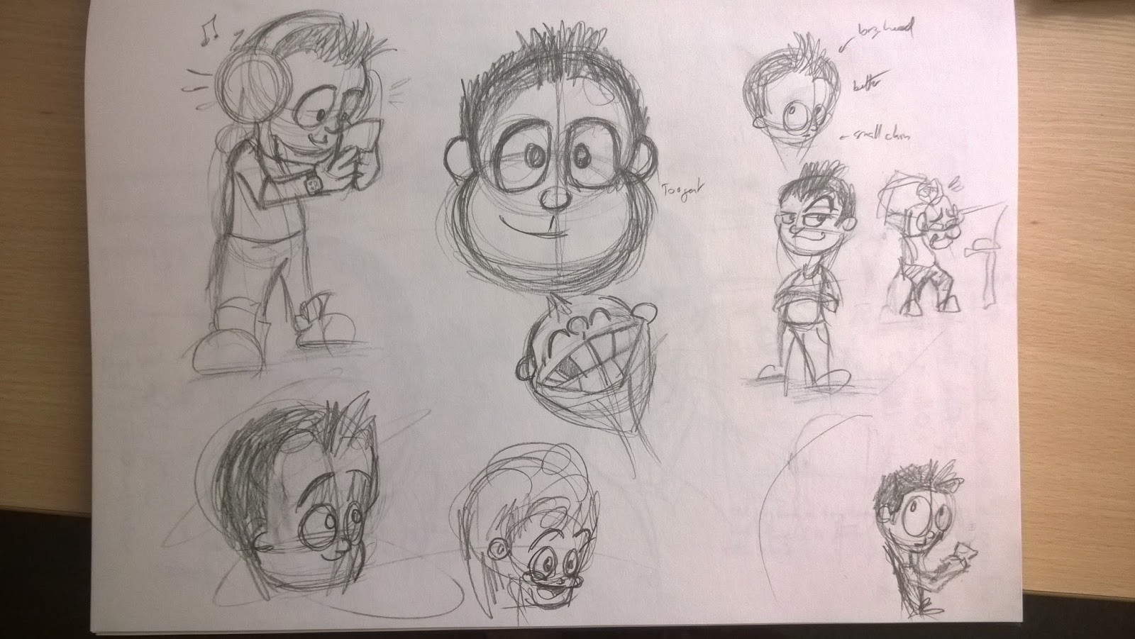
Young Boy
The young boy was challenging to design because i wanted to base a current and well known 3D animator after him. however most of these animators are older and it is difficult to show these distinct and mature features on a much younger character. Therefore I continued with a simplistic and youthful design and designed his look from his personality because the young boy is not shy or much of a push over, however he is not a bully or aggressive character. This is why i gave designed with spiky hair but with a friendly simplistic face. (these images are 2D but would intend the final outcome to be 3D).

Poster Ideas
A few sketches for initial ideas of what the poster may have looked like.


Production
I first created the initial poster design on paper as this allowed me to easily change ideas and produce more work effectively. once I was happy with the design I scanned the pencil image into Illustrator and Photoshop where I added line and colour to create the finished product. I used Illustrator to create the outline of the Old Man and Photoshop to create the lines and colour for the Young Boy and the Old Man. This is because I wanted to create the characters aesthetically different.
*the boy is no 3D ion the poster as I initially intended, this is because i had no knowledge on how to create a 3D model and it would have taken too long to create after I learnt how to. I did initially watch tutorials and other videos however my time was limited to complete this project therefore I used Photoshop to create the young boy character.


Conclusion
There are a re number of changes I would make to the poster if I were to repeat this project. firstly, I would make the Young Boy 3D to accurately show what the character would look like. I would also improve the lines and colour of the old man because I am not completely happy how he looks. Id probably add something in the background to make the poster stand out more but nothing that would distract from the characters.


